Add-ons Manager Redesign Update
April 1, 2010
Greetings! I want to tell you about some changes to the add-ons manager you’ll be seeing in Firefox’s trunk release very soon.
Add-ons in the Content Area, Oh my!
The biggest change you’ll see is that the add-ons manager will no longer appear in a separate window, but in a tab in Firefox’s content space. This represents a big shift in Firefox’s interaction model. You can read more about the reasons for in-content display here, but the summary is that displaying in content:
- Allows for similar display across devices
- Allows for quick updates from external sites, like Mozilla Add-ons (AMO)
- Gives more screen real estate to tasks, allowing for less constrained interaction
- Eliminates the need to manage small, easily-hidden windows
Eventually, we’d like to move many of Firefox’s various “extra” windows (Download Manager, Bookmarks Library, etc) into the content area. The add-ons manager, by being the first, will hopefully provide a solid working model that will guide the redesign and improvement of Firefox’s other windows.
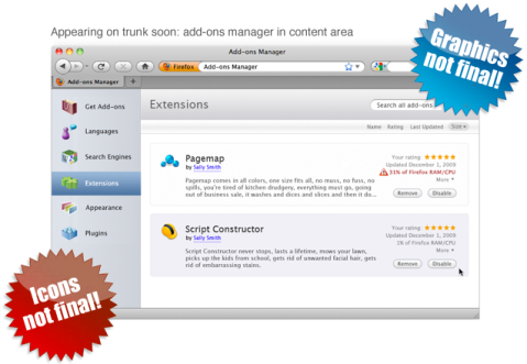
So, what will you see when this thing lands in trunk? Something like this:
Ugh, These Icons Aren’t Final, Are they?
No, they’re not. Can you not read giant ridiculous gradient-heavy starbursts?! These are not the final graphics nor colors; they’re placeholders for now. In redesigning the add-ons manager, interaction design and visual design were kept deliberately separate. What you’ll see in trunk is a reflection of the new interactions in the add-ons manager – viewing in a tab, configuring and installing add-ons, etc. The final visual look will come later. This is partially because there’s still kinks to work out before the final graphics are created, and we’d like the community to try out the manager before it’s 100% done.
A Model for Firefox’s “Extra” Windows
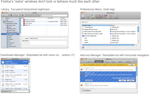
There’s another reason the graphics aren’t final. If Firefox’s extra windows are going to move into the content area, they have to feel very different from the rest of the web. They need to feel fundamentally a part of the browser itself. They also need to feel like a part of Firefox and the operating system. Additionally, they need to feel like each other. One of the goals here is to make Firefox’s look and feel more cohesive. The browser is the one stable part of the browsing experience. The web is a dizzying array of different content, and the browser should provide a dependable framework for exploring it. Right now, Firefox’s style is inconsistent in many places, both in design and interaction.
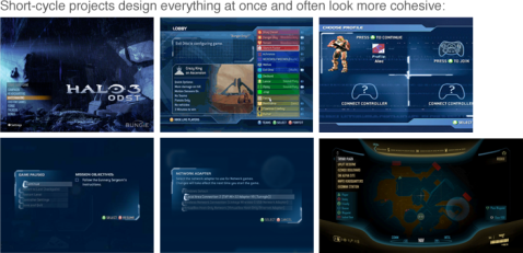
It looks like different parts of Firefox were made by different people at different times because, well, they were. Compare that to a product with fewer people working on each feature’s interface and a much shorter turnaround cycle.
Incongruous design is often a result of software having an organic development cycle over a long period of time; different parts begin to look and feel very different to each other.
One way to mitigate against organic growth creating dissimilar design is to make and use style guides. Firefox follows them for code and terminology, but we don’t have much for interaction and interface design. So, before we can really bring all these extra windows to content, we need a clear picture of the interactions and style that we’re following. Starting this process has been contingent on the new Firefox theme becoming solidified. Stephen Horlander‘s done incredible work here, and we can feel confident moving forward with a plan for these other windows. This is a separate project that I’m starting up and will be blogging about in the future.
Design Influences
Even though the graphics and style are not yet final, I wanted to point out some of the projects that influenced the interaction of the add-ons manager redesign. Nothing is ground-breakingly new in the manager, and this is deliberate; I was trying to find the simplest interactions that would work for a wide variety of content and users.
One simple interaction being used is the two-panel design itself. “Zooming in” to information by moving right has become a standard of application design. All major operating systems have a similar interaction here: selecting an item on the left shows its contents and/or details on the right (the opposite is true for right-to-left language readers). This design is already being used in Firefox for the History sidebar, Bookmarks Sidebar, and Library.
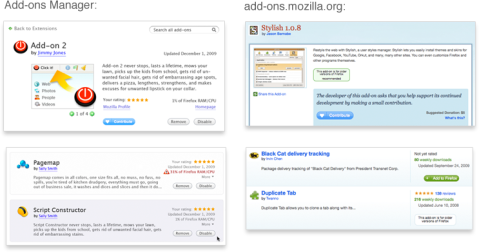
The basic layout of the addon manager’s “digest” and “detailed” view are similar to the layout of addons on addons.mozilla.org (AMO). Luckily for us, AMO had a recent redesign and solved many of the problems of displaying add-on information. Giving summary information in a list helps find an add-on of interest, and more information is available on click. Using a similar style to AMO was also important because of how intrinsically the add-ons manager and AMO are related. Treating add-ons differently within Firefox would mean that add-ons users would have to learn two systems rather than one.
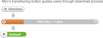
Other bits of the design are inspired by small interactions I’ve seen other applications get right. For instance, add-ons in the manager can be downloaded from within the manager. But, popping open the Downloads Manager to show a progress bar would clutter the interaction. I looked around for an elegant way to do in-content downloads, and found it in the video player Miro. Miro elegantly turns the download button for a video into a progress bar, meaning the user does not need to look away from the target they clicked on. They also incorporated pause and stop button beautifully into the bar itself. The new add-ons manager handles the progress bar very similarly.
Another element of Miro I thought was a good idea was the very subtle “Show More” button, which gives an expanded view of the selected item. This works well for add-ons as well as videos, and thus the redesign has a similar link.
The view of multiple add-ons was also inspired by task-management application Things, which also groups right-paneled items into expandable boxes.
Better close out before this gets too much longer. Tune in next time for: why themes are hard. Hopefully I’ll have a better title by then.
Filed in Add-ons, Firefox, Next Version
Tags: add-ons manager, AMO, miro, panels

April 1, 2010 at 7:24 am
Thank god! It is deeply unclear to me why FF has insisted on having separate windows for things like this so long. They are kind of wretched (especially the download manager!)
April 1, 2010 at 8:19 am
mkehrt,
For the download manager, check out the post here:
http://limi.net/articles/improving-download-behaviors-web-browsers/
April 1, 2010 at 8:40 am
Coloring the tab differently than the rest of the tabs should make it obvious in comparison to normal users (those who change the colors of tabs usually are smart enough to figure out what parts are browser bits and what parts are not).
April 1, 2010 at 8:42 am
I am hoping that the customize window also becomes a tab.
April 1, 2010 at 9:32 am
Excellent! Although why not go even further and replace the “get new add-ons” pages with a hyperlink to AMO? Otherwise, aren’t we just doing the same thing twice?
April 1, 2010 at 9:37 am
Looks good so far – when will we see this in production?
April 1, 2010 at 11:58 am
When will this begin landing in Trunk? I have “played around” with Chrome and find it nice to deal with add-ons in a tab rather a separate window. I did try using MR Tech Toolkit to open the add-ons in a tab, but is was not satisfying like in Chrome.
April 1, 2010 at 2:26 pm
One thing this whole idea reminds me of is the Office 2010 Backstage view (which you didn’t mention at all). Any chance of just seeing something more like that implemented (i.e. if we’re going to have a “Firefox” button that I assume provides access to this, why not have a whole “Firefox panel”)?
April 1, 2010 at 4:58 pm
Ah! I think that first draft of new add-ons manager should be more similar to Windows, not to Mac!
April 1, 2010 at 5:03 pm
For those asking when we expect to see this on trunk, I can’t give you a definite answer. We are going through the final review process for the initial landing right now, but there is quite a lot of code to get through. I expect we’ll have it on trunk within the next week though.
April 1, 2010 at 5:08 pm
Thanks for the update.
April 2, 2010 at 12:39 am
“Coloring the tab differently than the rest of the tabs should make it obvious in comparison to normal users (those who change the colors of tabs usually are smart enough to figure out what parts are browser bits and what parts are not).”
I still like to have a differentiation between a firefox related tab and a regular tab. How about locking it to onr side ?
April 2, 2010 at 6:32 pm
This is an excellent update,thanks for sharing.
April 7, 2010 at 12:57 am
This is disappointing. I liked the download manager being in a different window to differentiate it from the other windows. Also, if many windows are open it is a waste of time to look through the windows to find that specific tab. I hope it is possible to revert this in about:config.
April 7, 2010 at 5:11 pm
Waiting to see this excellent update!
April 28, 2010 at 11:20 pm
Just a question, if I have “Open new windows in a new tab” unchecked & the tab bar hidden, does it still open in a new tab when I select it from the menu?
Throughout this series of articles you continued to talk about add-ons in a new tab (id est, the content area) but never explicitly mentioned what the default would be (new window or new tab, but either way, in the browser’s content area). I explicitly avoid tabs because they break the [Window] menu & Exposé.
If the add-ons manager is going to be setting the standard on this, I would like some clarification on what that standard will be since tab killers generally break with every new release & are overkill if this can be handled by the browser anyway & I wouldn’t want tabs to replace windows as the basic unit of an application’s display. Thanks.
April 29, 2010 at 6:34 pm
[…] final patches to land now. The bit most people will see is the new UI so I guess I’ll steal Boriss’ image for you to look at here with the same caveats. What you see on trunk over the next few days […]
April 30, 2010 at 12:59 pm
”A Model for Firefox’s “Extra” Windows
There’s another reason the graphics aren’t final. If Firefox’s extra windows are going to move into the content area, …”
Are you aware that the present Firefox’s “Extra” Windows (e.g download, Bookmarks Library, etc.) cause a problem ? If, when one of them is open, you close first the main FF window asking to keep memory of tabs then the extra window the memory is lost ! Do I have to fill a bug or will your new design correct this ?
April 30, 2010 at 1:26 pm
[…] now.Also it is worth noting that the icons and graphics are not final, this has been verified by Boriss himself. The plans for the add-ons manager has not been revealed since it is in early testing […]
April 30, 2010 at 1:43 pm
[…] Firefox nightlies.Several blogs have already reported about the changes including Mozilla Links or Boriss’ Blog.Overview of the changes in the new Firefox add-ons manager:Redesigned user interfaceLanguages, […]
May 1, 2010 at 7:02 pm
[…] Several blogs have already reported about the changes including Mozilla Links or Boriss’ Blog. […]
May 2, 2010 at 1:40 am
[…] Several blogs hit already reportable most the changes including Mozilla Links or Boriss’ Blog. […]
May 6, 2010 at 7:00 pm
[…] So, do you like the planned change? You can read more about it on Boriss’ Blog. […]
May 9, 2010 at 10:09 am
I think add-ons manager and other things should still have their own window, only the download manager is the one which I think should be integrated to the main window some way.
May 9, 2010 at 10:11 am
Almost forgot! If I close the main browser window, if there are any downloads running, they should continue in a window, and all other child windows should be closed automatically. And, finally, it should keep the session if you asked Firefox to save it when you closed the main window.
May 10, 2010 at 11:30 am
Hi,
I’ve just tested the problem that session is not saved when asked but a child window is open and it’s closed after the main window with Minefield 3.7a5pre Build 2010050804010007, and it seems to be fixed.
May 10, 2010 at 3:55 pm
Very good new if the problem is fixed in the next release : it was annoying to loose all session info !
May 21, 2010 at 10:35 am
[…] Several blogs have already reported about the changes including Mozilla Links or Boriss’ Blog. […]
June 14, 2010 at 9:07 pm
All is more interesting in a tab.
I need an addon to do this and I should not need to.
If Firefox come with this function, I will be happy, much happy.
August 29, 2010 at 8:57 am
[…] posted quite a few mockups on this blog of Firefox’s redesigned add-ons manager’s features and interactions. What I haven’t shown are screenshots of how the manager will actually look […]
July 2, 2012 at 2:26 pm
[…] it is worth noting that the icons and graphics are not final, this has been verified by Boriss himself. The plans for the add-ons manager has not been revealed since it is in early testing […]
March 26, 2013 at 8:17 pm
which is becoming more demanding city of the America.
A lot of people in this state choose to acquire ocean front house and design beach homes.
There are generally at least one to a dozen photographs
of the Florida homes for Sale, plus a link to a virtual tour.
July 13, 2013 at 10:39 am
Omg, I remember the times before this update. Never want to go back. 🙂