Removing Firefox’s Status Bar and Rehousing Add-on Icons (Part 2 of 2)
June 7, 2010
Recently, I wrote about Firefox’s status bar and how we’d love to remove it, relocate its functionality, and dedicate that area back to page content. Though many add-ons currently place icons in the status bar, these icons could be displayed elsewhere in Firefox’s user interface. By treating add-ons as UI elements that users can move within Firefox’s UI, the bottom of the browser window could be dedicated to content while the functionality of add-ons preserved.
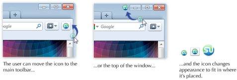
I proposed that by default, add-on icons display in the bookmark bar of the Firefox window.
But, if the user wishes, he can move the add-on icons to other areas. Firefox can subtly change the appearance of an add-on icon to visually match where it is placed.
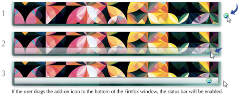
Several commenters on my previous post noted that they preferred add-ons in the bottom right of the window, both because of particular add-on functionality and familiarity. Indeed, it should certainly be an option to reenable the status bar, and one way to do this should be to drag an add-on icon to the bottom of the window in customize mode.
The cases that would be especially suited to enabling the status bar are add-ons that require long, horizontal space in the main UI. Especially newer add-ons built by Jetpacks are increasingly using this horizontal space in creative ways. If users want this kind of functionality, giving up a significant portion of the bookmark bar should not be the only way to achieve it.
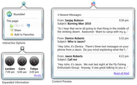
While this horizontal layout that some add-on developers choose is useful for many kinds of information display, it takes up a lot of space in Firefox’s interface and may not always be necessary. Providing API support for rich content panels that launch off of add-on icons could allow add-ons to provide rich interactive content, accessible with a click, that takes up little UI. This is a win for developers because it would enable them to easily add rich content to their add-ons. It’s also a win for users, because accessing rich add-on content won’t always mean sacrificing interface space. Some possible uses for such panels include:
Firefox engineer Dietrich Ayala and Labs engineer Myk Melez are already at work to add an API to Jetpack that will allow these panels to launch from add-ons.
Filed in Add-ons, Features, Firefox, Next Version, User Experience
Tags: jeps, jetpacks, panels, single ui element


June 7, 2010 at 7:52 am
They look similar to the
https://wiki.mozilla.org/Firefox/Projects/Doorhanger_notifications
Perhaps matching the UI for both those from the site identity button and from add-on buttons will provide a consistent user experience.
June 7, 2010 at 8:06 am
But won’t the bookmarks toolbar be off by default in Firefox 4? And even if not, many users turn it off because they consider it a waste of space. Those will never notice new add-on icons appearing there…
June 7, 2010 at 8:32 am
Having too many icons and panels on the bookmark & navigational toolbars would make it top heavy and cluttered.
I am not convinced with the panel idea after having had enough with the balloon msgs in XP.
And please dont make the same mistake as Chrome’s by not having a dedicated area for addons.
Addons are Firefox’s strength and there shouldn’t be any compromise when dealing with them.
Maybe a Chrome-like floating toolbar which would convert into a permanent toolbar, when addons occupy it could be a solution.
Please implement a tryserver build for experimental UX desicions and give the community choices (UI A, B, C…) instead of debating with a single model.
June 7, 2010 at 8:39 am
Fully customizable translucent floating toolbars consisting of a few opaque icons (Google maps?) instead of a full toolbars could be interesting.
June 7, 2010 at 9:34 am
[…] June 7, 2010 via jboriss.wordpress.com […]
June 7, 2010 at 9:44 am
How many would understand that you could drag an icon to the status bar? While I generally like customization, in this case it feels like you gave up on trying to find a solution and instead want to leave it up to the user, who leaves it up to the add-on developer. Clutter and confusion ensues.
I think the best solution would be to make a dedicated space for add-ons, that scales. Add-on developers should be urged to place them there for consistency.
And, oh, what about Link URL preview?
June 7, 2010 at 9:48 am
The panel idea should be further developed, but it doesn’t cover all of the cases. Some of the information needs to be picked up by glancing at it. Having to navigate to the icon and click on it defies the purpose, like with the world clock app.
June 7, 2010 at 9:56 am
Oh, please no pop-up balloons! I despite this UI element whenever found. Your example pictures illustrate my point nicely – which one do you find easier to use: weather forecast in status bar or hidden in an icon?
The second option would drive me mad quite easily and lessen my productivity (I would click on it much more than needed, instead of a quick glance at the status bar).
Some elements work much better when always visible, IMHO. Please don’t remove the status bar. Or make it automatically enabled when an add-on that needs it is installed.
June 7, 2010 at 11:47 am
You propose to remove the status bar, but where do you want to move the url to links that you hover over? This is the main function of the status bar currently and I think the web is safer when people at least have the chance of knowing where they are going before clicking a link.
June 7, 2010 at 11:48 am
I’m not sure I agree with the bookmarks toolbar approach. I’m not sure that most people would see trading one horizontal toolbar for another as an improvement.
One of the things I do like about the panel-pop-out approach is that is allows for the panel to pop-out horizontally, which would allow for some form of vertical addons/controls toolbar. With wide screens, moving the back, forward, reload/stop, home buttons and addons icons to a vertical bar rather than a horizontal one is reasonably attractive to me.
June 7, 2010 at 11:48 am
I like your idea, and I love my status bar. So bring it on! Stop with the mockups and start working on it 🙂
June 7, 2010 at 12:09 pm
The first thing I will do when installing Fx 4 is look for an extension or tweak to turn the status bar back on. I’ve been using it for 15 years and see no reason to stop now.
PLEASE ensure that you leave code ‘hooks’ in place to allow extension developers to re-instate the status bar.
June 7, 2010 at 12:46 pm
“Recent” was a month ago. And can we please have some implementation? I agree with Tiago Sá. ITs time to put this stuff to work.
June 7, 2010 at 1:23 pm
If you’re not gonna reinvent the status bar, may I make a request please. Can we have it outside of the content area (browser window) and make it use glass much like how Opera does? In fact Opera’s implementation would be prefect.
June 7, 2010 at 1:38 pm
>add-on icons display in the bookmark bar of the Firefox window
Agreed this will work well for most users.
If we could enhance the functionality the “bookmark bar” at the same time that would be a double win.
e.g.
Boox
Places’ Full Titles
Stay-Open Menu
___
Live Bookmarks have been woefully neglected of late 😦
June 7, 2010 at 6:55 pm
>Indeed, it should certainly be an option to reenable the status bar
Oh thank goodness. Personally, I still think even having off by default is a horrible idea, but FF is only my secondary browser anyway…
June 7, 2010 at 9:28 pm
You know, while you’re thinking about milking every pixel of content real estate that you possibly can, how about getting those pesky scroll bars out of the way, too? I think Bespin has a great solution for this one; make the scroll bars mostly transparent until mouse-over.
June 7, 2010 at 10:19 pm
Will these panels be JetPack only? Firefox only? I cannot really guess from the text.
The place where those panels belong is toolkit XUL, so that all mozilla-powered applications may use it.
I furthermore don’t really get the rational behind “maximize content space at the bottom”. Usability-studies with eye-tracking show that the very bottom isn’t in the user focus anyway.
(e.g. http://www.useit.com/eyetracking/)
The bookmark toolbar is an awful place for any such extension “icons” (granted it is still enabled by default in fx4).
I’d propose:
(* Hide the bookmark toolbar by default)
* Hide the statusbar by default (if you really have to)
* Show the statusbar if it contains something (extension “icons”) or during customization of cause.
* Consider the statusbar a toolbar, i.e. let users customize it with the very same “customize” action they can already use to customize the current toolbars with
* Provide some API for addons to add stuff to the statusbar. Make additions some kind of “opt-in” if possible.
That isn’t actually that far of from your proposal
June 7, 2010 at 10:46 pm
To get some idea of the practicality of this idea I have replaced all of the status-bar icons that have alternative toolbar buttons on my FF3.6…
Surprisingly easy transition tbh.
I now have greasemonkey and nosquint left but if they could be moved as per your plan for 4.0 then that would mean I would have no problems killing the status bar…
I will have to see if this is workable in the longer term though.
The only thing I would need the status bar for is link hover, hmm are you proposing the chrome model or having them show in the address bar?
June 7, 2010 at 11:49 pm
very simple: vertical toolbar
June 8, 2010 at 9:38 am
@Jack
And steal the much needed horizontal space? That’s crazy! We can never have enough horizontal content space!
June 8, 2010 at 4:25 pm
Modern screen have ‘more’ space in the horizontal that vertical.
So it may be a good idea to give hspace back to the origin used, the main window.
But moving icons to another horizontal bar don’t solve the problem. For me, I don’t use the ‘bookmark’ bar .. because of loosing that space. Instead I use the “Sidebar” .. not that bad because in the horizontal most pages fit well to the “rest”.
How about another vertical bar to the right? With the popup panel from those icons we have all we need!
June 8, 2010 at 6:33 pm
Personally I think you ought to standardize it to make use of the title bar. That’s horizontal space that you’re not going to cannibalize with tabs, like Chrome, so why not re-purpose it in a different fashion? This allows more space for “at-a-glance” icons as well.
Another idea: if you’re going to convert them all to icons w/ pop-outs and you’re trying to save vertical space, perhaps consider sacrificing some of the scroll bars’ space?
June 9, 2010 at 9:06 pm
Why using a whole bar for one tiny little symbol? Alternatively, you could have a small bar at the bottom right, just as high as the status bar would be, but only with some 2 centimeters in vertical direction, growing with the number of new add-ons placing a symbol to the UI.
Thus, you’d still have the symbols at the position the users would expect them to be and leave the space in the middle of the screen to content (given, of course, that the number of your installed add-ons wont let the bar swell to there and beyond).
June 9, 2010 at 11:41 pm
I think that what Nils Maier said is very relevant. The bottom part of the screen is not relevant to the eye, so I guess it’s ok to leave the status bar in. If it is disabled by default, it’s ok, as long as I can get ALL the information I need about page loading, and as long as I can see the links I hover without some crap popping up at the bottom of the screen (and with a delay!!! like Chrome, BLERGH).
June 10, 2010 at 7:21 am
The first extension that I install is Tab Kit which allows me to put the tabs down the left side of the browser window.
I hide the bookmarks toolbar as I have never used it.
The status bar is useful in my opinion as it provides a separation of the content of the page from the OS elements. Most of its information is not required all the time but is useful to have available easily when it is.
June 16, 2010 at 5:32 am
[…] know I implied in my last post that you’d be free of this topic forever, but something was bothering me. A piece of the […]
June 16, 2010 at 11:40 am
[…] (congratulations!) – has been discussing the removal of the status bar on her blog in a three part […]
June 19, 2010 at 8:39 am
thanks for posting, I really enjoy it, I can learn a lot from this.
July 6, 2010 at 4:00 pm
I feel, tool-bars are mostly used for providing some sort of functionality, while the status-bar is mostly used for displaying some sort of information..
So for the time being, can we have something like multiple collapsible folders to organize the status bar icons. This way users can organize what they wish to see most and what can be collapsed..?
This will surely make dealing with add-ons a lot easier..
July 9, 2010 at 12:19 pm
I want to thank you for another fantastic post. I am always on the look-out for fantastic WordPress theme to suggest to my own readers. Thank you for taking the time to write this post. It’s just what I was trying to find.
July 10, 2010 at 4:51 pm
The application of modern sofa bed is rising as a component of modern lounge. The firm serves middle-income people where they want to save space for the mobile space in their modest home. Modern sofa bed can be a solution of space-saving furniture in your home because it can serve as sofa and bed in one.
August 2, 2010 at 4:31 pm
I’ve been all over the internet the last few days digesting every piece of information I can get. Sorry my english, but this is great site and nice text , I wil add to my bookmarks. Thank you.
August 16, 2010 at 9:01 pm
I really think having no status bar is fine for the very basic user, but I do believe your user base is far from “basic”.
Making the status bar more customizable, e.g., dragging/dropping elements (like a toolbar), resizing panels, maybe allowing to change its height and such would be great. If you really want that space then hide it by default, but don’t remove it.
Having a fixed position where to look for information is very useful. If you put the links info a tool-tip, what happens with any (custom?) tool-tip that may already exist in the page? –Chrome’s “solution” is just laughable.
Also, don’t forget many developers still use the status bar to convey information to users,at the very least as a fallback method for custom tool-tips.
By the way, the Vista-like panels I saw in your screenshot send chills down my spine. Has it occur to you that there may be information that the user would like to keep visible? In my experience, such “panels” are just a usability nightmare.
Empowering the Status bar could solve all your issues. Let the rest to the amazing people building extensions, they are better than what you think.
September 6, 2010 at 6:56 pm
[…] a number of blog posts, and will surely continue. For more information, please read parts 1, 2 and […]
September 22, 2010 at 7:33 pm
@Jack woah
September 28, 2010 at 10:53 am
The status bar is gone in the nightly build of Minefield that I am using. (Says 4.0b7 pre but no number in “About …”, current date is 9/28/2010.) I may find a way to bring it back. (Perhaps something about my other configuration is a problem.)
There is one function I miss that others have not mentioned. When pages are slow to load, the status bar tells me why, because it has separate indicators for “looking up …” and “loading…”. (I can’t recall the terms because I don’t have it anymore!) When the first one is the problem, I suspect that Verizon has yet again changed it DNS setup, so I consider switching the DNS in my router.
October 17, 2010 at 11:13 am
i think it would be better if the status bar is on
October 31, 2010 at 1:49 am
sofa bed are very very comfortable and i love to sleep on them ::
August 20, 2011 at 10:04 am
Oh hey I wanted to write and say i love reading your blog!
September 15, 2011 at 6:27 am
Hello There. I ran across your webpage using yahoo. This is the very beautifully published content. I’ll be sure to save it and go back to read additional of this beneficial details. Thanks for the publish. I’ll probably definitely returning.
May 29, 2012 at 10:07 am
How did you make a blog look this good! Email me if you get the chance and share your wisdom. Id be appreciative.