(Note: the following has been cross-posted to Mozilla UX)

Two Firefox features getting a redesign in Firefox 13 (currently in beta) are the Home Tab and New Tab. Home Tab can be viewed by clicking house icon in Firefox or by typing “about:home” into your URL bar. New Tab appears when you click the “+” at the end of your tab strip.

Firefox 13 New Tab Page

Firefox 13 Home Tab Page (launch targets emphasized)

Firefox’s Home Tab and New Tab have, until now, had fairly basic pages. In Firefox 12, Home Tab had a large search bar, a “snippet” which Mozilla uses to display messages to users, and little else. The main reason the search bar is on Home Tab is because many users click the Home button to initiate a search, either unaware of the toolbar search box or preferring not to use it. The snippet allows Mozilla to give a message to users, such as last October when it asked users in the United States to contact their representatives when the anti-internet-freedom bill SOPA was being heard in the House of Representatives. Such messages can be important while not being urgent enough to disrupt users with a notification.

New Tab, for most of Firefox’s history, has been completely blank. This was done deliberately to offer users a clean, fresh “sheet” to begin a new browsing task. However, a blank tab may not be distracting, but it’s also not useful.

Surely, we thought, we can present a more helpful design than a blank page! Using Mozilla Test Pilot, we began to research how Firefox users use New Tabs. What we learned is that each day, the average Firefox user creates 11 New Tabs, loads 7 pages from a New Tab, and visits two unique domains from a New Tab. The average New Tab loads two pages before the user closes or leaves it.

What this tells us is that users create many New Tabs, but they’re very likely from those to return to a limited number of their most-visited websites. So, we began to experiment with giving users quick access on New Tab to the websites they visit most frequently.

What you’ll see on the New Tab page of Firefox 13 are your most-visited sites displayed with large thumbnails, reducing the time it takes to type or navigate to these pages. This data comes directly from your browsing history: it’s the same information that helps Firefox’s Awesome Bar give suggestions when you type. Or, if you want to go somewhere new, the URL bar is still targeted when you type on a New Tab page. If you want to hide your top sites – permanently or temporarily – a grid icon in the top right wipes the new tab screen to blank.

Mozilla Home is getting a redesign, too! While still keeping the prominent search bar and snippet, the graphic style is softer, the text is more readable, and launch targets at the bottom allow you to quickly access areas such as Bookmarks, Applications, and previous Firefox sessions.

Both Home and New Tab are being improved as part of our longterm vision of making Firefox more powerful, engaging, and beautiful. Over the next few releases, more design improvements will be made towards this goal. For now, please try out Firefox’s new Home and New Tab pages in Firefox 13 Beta and tell us that you think!

I’d like to highlight the awesome research project that intern Lilian Weng is leading around Firefox’s new tab page.

While our goal is to make users more efficient at their browsing tasks, what makes them more efficient is a question we keep returning to. Most other browsers display links on new tab pages based on frecency. Frecency is a portmanteau which combines frequency and recency. At Mozilla, we use it to refer to sites that users have been to often, recently, or both. It’s how we calculate what should be the first, second, third, etc site that appears when you type a letter into Firefox’s URL bar.

Using frecency to list links on a new tab page seems an obvious design direction, but we want to truly investigate whether another solution would be best for users. So, Lilian is spinning up a brave new study. Once her test is ready, users of Test Pilot, our platform for collecting structured feedback on Firefox, will be asked if they’d like to participate in a new study. If they say yes, they will be randomly assigned one of six new designs on their new, blank Firefox tabs. One of these six designs will be our control group: a blank white tab, just as Firefox users see currently. The other five will look almost identical to each other. They will display a simple 8×8 grid of favicons set on a button which is colored to highlight them based on a color-matching algorithm designed by Margaret Leibovic:

Minimal 8x8 Grid Layout of Site Links

The only variable that will be changing among the five designs is which sites are displayed in this grid. Here’s the five variations we’re testing:

  1. Frecency. A combination of a user’s most frequently and most recently visited sites.
  2. Most recently bookmarked sites. By displaying prominently what a user has recently starred, we effectively turn the new tab page into a read it later list.
  3. Most recently closed sites. This could lead users to treat new tab page as an undo feature, or close tabs in order to temporarily store them in the new tab page as a short-term read it later list.
  4. Sites based on content similarity. Intern Abhinav Sharma is trying out his project, called Predictive Newtabs, which displays sites based on where the user has opened a new tab from. For instance, if the user has been browsing a news site, a new tab would offer other news sites the user has been to.
  5. Sites based on groups of sites frequently visited together. In another part of Abhinav’s Predictive Newtabs experiments, he has designed an algorithm to predict sites to show based on sites users visit in groups. For instance, if every time you get to work you first check the weather and then check stock prices, this new tab would offer you a stock page on a new tab after you checked the weather. If you want to try this experiment out yourself, you can download the Jetpack here.

The above study is still in preparation, and once it goes live I predict that we’ll learn tons of valuable information about how new tab suggestions can positively impact users. Lilian will be collecting data on many aspects of users’ responses to these designs, such as how they effect the breadth of sites users visit, how likely they are to click on each item in the grid, and how long they spend deciding where to navigate. I can’t wait to start pouring over the data that comes back: it’s very new research in an area that has a profound impact on how we use the web.

Whenever you open a new tab in Firefox, your goal is to navigate somewhere.  To aid your navigation, on this new tab Firefox currently offers you… nothing.  Just a blank page.  100% white, and 100% not useful.

Firefox has been displaying this blank page when users open a new tab for as long as there’s been a new tab.  And, partially, it’s deliberate.  After all, a blank page is guaranteed not to distract you from your current task.  It’s just clean and white, like a canvas, offering no suggestions for the next move and no distractions from it.  Alex Faaborg explains very well in his recent blog post the concerns we have with distracting users and the ways that data overload on a new tab page can be harmful.

This isn’t the case when you open a new tab in other browsers.  Opera was the first to offer a “Speed Dial” with giant thumbnails linking users to their most frequented sites.  Safari’s giant wall-o-televisions offers much the same.  Chrome has played around with different designs, first trying a speed dial like Opera’s and later integrating other content, such as apps.  Internet Explorer, the most unusual of the designs, offers you some options: reopen closed tabs and sessions, start private browsing, or use an “Accelerator,” which usually means do “something with Bing.”

What happens when you open a new tab in different browsers

So, which approach is best for our users?  Would presenting large thumbnail targets to direct people to sites they frequently visit save them time?  Could we present information to make it easier for users to navigate to their next destination?  Can we do so without being distracting and leading users away from the task they had in mind?

We realized that we couldn’t answer these questions without finding out more about our users.  So, a few people at Mozilla are heading up studies to find out how people use tabs and how different designs of new tab page effect how they browse and user the web.

Here’s what’s going down:

1. Quantitative study through Test Pilot on what users do after opening a new tab

Intern Lilian Weng is currently working on a quantitative study within Test Pilot to capture data on what users do after they open a new tab.  This should answer questions surrounding user intention when opening a new tab, and possibly how long users take to perform actions after opening a new tab.

2. A/B test of a new tab page vs. blank new tab

Interns Diyang Tang and Lilian Weng are preparing to do an A/B test using Test Pilot to determine how user behavior differs when presented with a new tab page vs. none.  They are attempting to answer questions such as:

– Does a new tab page slow users down (e.g., by distracting them), or speed them up (e.g., help them find the target site faster)?
– Does a new tab page discourage breadth in visited sites?
– How do users navigate to a website after they open a new tab in each scenario? (location bar, search bar, top sites, bookmarks, history, etc.)
– Are there users who are more mouse-based and some who are more keyboard-based? How does a new tab page affect them?

3. Cafe testing for current Firefox

Diane Loviglio and myself are preparing more qualitative “cafe” tests to gain insight into how people use tabs currently.  We’d like to know why and when users open new tabs in a more contextual perspective than Test Pilot data provides.  Our goal is to find a wide enough range of users that the most common new tab behaviors can be grouped and discussed in a more tractable framework.

4. Testing multiple new tab page designs

Once the research from tests 1-3 is available, variations on new tab pages will be implemented and tried out with real users.  There are multiple testing methods that could be useful here, such as a multivariate testing or even journaling to gain insight into how new tab pages effect behavior of a user over time.

5. Creating a contextual speel dial implementation

Not quite a research project, but intern Abhinav Sharma is designing and implementing an experimental new tab page which uses contextual information about a user’s current browsing session to offer suggestions.  His page makes intelligent recommendations about where you’re likely to go next based on where you’ve been.  The project’s still in alpha, but you can see the code he’s done already for a basic speed dial implementation on his github.

You’ll notice that a lot of this work is being done by our awesome new Summer 2011 interns!  It’s only early June and they’re already rocking hard.

I’ll post what we learn from these studies as results come in.  I predict we’ll gain some insight into user behavior that will inform not only Firefox’s new tab design, but many other features besides!

Firefox 4 is right around the corner, and the Firefox’s community and team are working their butts off to make it as awesome as possible. The blocker list is going down every day, and the browser’s looking better than ever.

However, with everyone putting so much effort towards blockers, there are less people available to help with polish bugs for the add-ons manager. In particular, there’s a handful of bugs – mostly in CSS – that would take the add-ons manager from good to awesome. If you know CSS and are interested in helping with a feature used by millions, please consider taking a look at one of the remaining bugs. Not only will you be hailed as the people’s hero (by me anyway), but you’ll be helping millions of people customize their browsing experience.

Here’s a diagram of the remaining add-ons manager polish bugs:

www.donotlick.com

If you need any information or help, comment I’ll get in touch with you!

I’ve been blogging about Firefox’s add-ons manager lately. But what does the add-ons manager look like on Firefox Mobile?

Current Add-ons Manager on Mobile Firefox

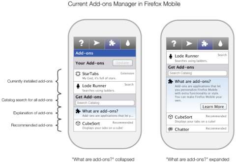
Currently, the Android/Maemo add-ons manager in Firefox looks like the image below. At the top are the user’s installed add-ons. Below them, a “Get add-ons” section includes add-on catalog search and five recommended add-ons. Below these is a “Browse all add-ons” button which links to Mozilla’s Mobile Add-on page.

Current Add-on Manager in Firefox Mobile

How Should Mobile Users Learn More About Add-ons?

Giving users information about add-ons has been a continual focus in the non-mobile Firefox add-ons manager redesign. Justin Scott has been leading the design of Firefox’s “Get Add-ons” pane. This pane, which loads within the manager itself, introduces users to add-ons by recommending popular add-ons and promoting the community behind them. The pane also includes a “Learn More” button, which will eventually link to a site which provides add-ons help, information, and even videos about add-ons.

This solution works well on the desktop because of the space available in the add-ons manager and the ease of loading content within Firefox. But would should the mobile solution to add-on information be? And where should that pesky “Learn More” link lead on mobile?

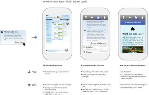
The first option is for “Learn More” to go straight to Mozilla’s page for Mobile Add-ons. However, this site is a portal to our huge catalog of add-ons: it doesn’t provide the simple explanation that “Learn More” implies. Also, it forces the user to leave the add-ons manager and load a media-dense page. Both of these could negatively surprise users.

A second option is for “Learn More” to expand the current “What are add-ons” section within the column to provide more detailed information within the add-ons manager. This has the benefit of consistency with the current mobile UI, where some sections already expand to show more information. It also doesn’t require users to leave the add-ons manager. However, this design also has a few drawbacks. The page height becomes much taller, requiring more scrolling to go between the user’s add-ons and the recommended add-ons. Also, considering the “What are add-ons?” section already expands with a click, now there would either be three levels of zoom or a large surprise the first click.

A third option would be to create another page, within Mobile Firefox’s preferences, that provides an explanation of add-ons. This is better than an external page, because it would not require a lengthy load time while presenting the most relevant information. It also may provide less of a surprise than the expanding in line option. But, it would require users to leave the screen they are on, and would be inconsistent with how the UI works now.

Three Possibilities for Where "Learn More" Link could lead

A Simpler Design

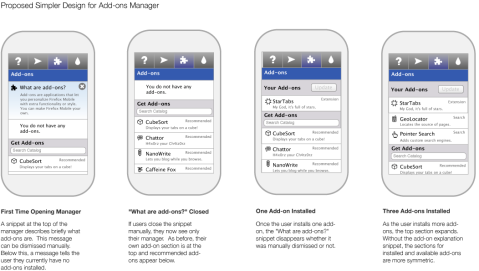
After considering these options and their drawbacks, I went back and thought about exactly what purpose the explanation of add-ons is meant to provide. In Firefox, this section’s purpose is to tell users who have never encountered add-ons what they are and why they are useful. In fact, as soon as the user installs a few add-ons in Firefox, they never see that explanation again. There’s no need for the message to be persistent, as it is currently in Mobile Firefox. In fact, as soon as a user installs an add-on, they no longer need the explanation. Making the message dismissible is the first step towards a better Mobile Design.

So, how can users gain more information about add-ons? And what information would they want?

Assuming that the “What are add-ons” snippet gives a good summary of what add-ons are, and add-ons themselves explain what they do in their descriptions, there simply isn’t enough information left to tell mobile users that justifies a separate explanation link. Additionally, on Mobile Firefox, there are less than 100 add-ons currently available. I simply can’t think of information about these add-ons that would be important enough to users to include a link and a separate page about what add-ons are.

So, the design I’m recommending keeps the explanation of add-ons short but prominent in the add-ons manager. It’s dismissible, but also disappears automatically once the user installs one or more add-ons. If the user wants to browse Mozilla’s Mobile site, the “Browse all add-ons” link at the bottom of the list will direct them there. With such limited screen space, keeping the interface simple should provide the best experience.

Proposed Design for Mobile Firefox's Add-ons Manager

I’d like to give a few updates on the continued implementation of Firefox 4’s new add-ons manager. As development work continues, some parts of the manager’s functionality have been adjusted and updated since I last posted mockups. Here are a few highlights of what’s been going on.

Add-on Specific Notifications

Each add-on in the manager could have one of several notifications that only pertain to itself. How can it be made clear when an add-on needs attention or action? Stephen Horlander first experimented with adding subtle coloring and diagonal stripes to each add-on. In the latest nightlies, this method is expanded to give the full range of add-on notifications. Red and yellow signify different levels of potential problems, while grey and green signify when an add-on requires attention or action.

Here’s a mockup of what these notifications would look like in the manager:

In Detail View, where only one add-on is visible, notifications appear at the top of the pane.

Global Add-on Notifications

Notifications that relate to all add-ons now display in the scope bar (bug 566194). The color of global notifications follows the same scheme as notifications for individual add-ons.

Hiding Browser Navigation Widgets

The design of the add-ons manager is enhanced by displaying only relevant parts of the browser chrome and hiding those that don’t relate to the page (such as the URL bar and reload button). Some benefits of doing this  include:

  • Presenting a minimal, clean UI
  • Creating a distinctive in-content page that no other site can mimic – vital because of the far-reaching changes which can be made within in-content pages
  • The user only sees actions that they can take. Reload, for instance, is needless on a page that’s locally hosted
  • Space in the navigation bar normally used for browsing buttons can be repurposed for widgets useful for in-page content. For instance, the URL bar space can be used in future Firefox versions to present breadcrumb navigation for in-page content.

Progress towards removing browser navigation widgets is being tracked in bug 571970. Unfortunately, this will only work when Firefox is in its default tabs-on-top mode. Removing elements for tabs-on-bottom configurations involves changing the entire theme of Firefox substantially.  In order for fast tab switching to remain possible, tabs would need to remained aligned in tabs-on-bottom mode while still preserving the minimal style of in-content pages. This will be the goal for a future version of Firefox.

Downloading Add-ons within the Manager

If you run Firefox nightlies, you may have noticed that if you install an add-on from within the add-ons manager, the installation process happens fully within the manager.  By turning the download button into a progress bar, the user’s focus need not move; the relevant information for the download is where the user was looking in order to prompt the download. After the add-on is downloaded, a notification will display on its entry alerting the user that either the installation is complete or that a restart is needed.

A notification will appear over themes and backgrounds when they are fully implemented in the manager.  These and other changes that only effect the style of themes and backgrounds will be implemented in future versions of Firefox after 4.

Add-on Installation Process

We’ve also streamlined the process of installing an add-on from a website for Firefox 4. The new design uses Firefox 4’s new arrow notification panels to minimize the number of steps required. When the user begins an add-on installation, the download now begins automatically. For most users, this should only take a second or two. The user then sees the name, author, and source of the add-on, and has the option of allowing the installation of the downloaded add-on. Firefox only obtains this information about add-ons once they have partially downloaded, which is why the full information is presented after the download completes. Though the add-on file has already downloaded at this point, the file is not accessed unless the user allows it to be.

If the add-on does not require Firefox to be restarted, that’s it: the add-on is activated as soon as the user clicks “Allow”. If it requires a restart, the user is notified that a restart is needed and the add-on is activated after the next restart.

If you’d like to try out the new add-ons manager, try running the latest Firefox nightlies.  Some of the smaller style changes have not yet landed, but the behavior described here is ready for testing (and bug reports where needed!)

Add-ons Manager UI Update

August 29, 2010

I’ve posted quite a few mockups on this blog of Firefox’s redesigned add-ons manager’s features and interactions. What I haven’t shown are screenshots of how the manager will actually look in Firefox 4.0. The following are designs, based on Stephen Horlander’s work on the new Firefox theme, of the add-ons manager in OSX and Windows 7.  The icons are still placeholders, but the rest of the design is pretty near finalized.

In the image below, you’ll see three windows for each operating system.  The first row shows list view, where a short summary of each add-on and its description are shown.  Buttons allow the user to disable an add-on or launch its preferences.  Clicking “More” takes the user to detail view.

The second row shows detail view, where the user sees more information about a single add-on.  The full description is displayed as well as a contribution box if the add-on’s author chooses.

Finally, appearance view shows installed themes and backgrounds (previously personas).  Since these add-ons are primarily visual, the interface gives a large preview of each item and does not display a description.

Dave Townsend and Blair McBride have been working hard on implementing these visual changes as well as the slew of under-the-hood improvements that are making the add-ons manager faster and more stable.  To see how it’s coming along, try running a nightly build in your operating system of choice.  Hope you like it!